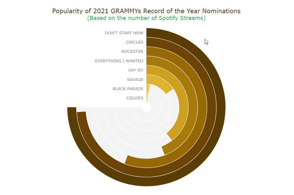
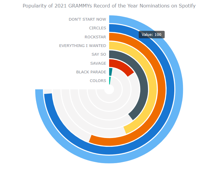
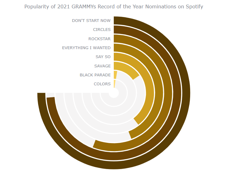
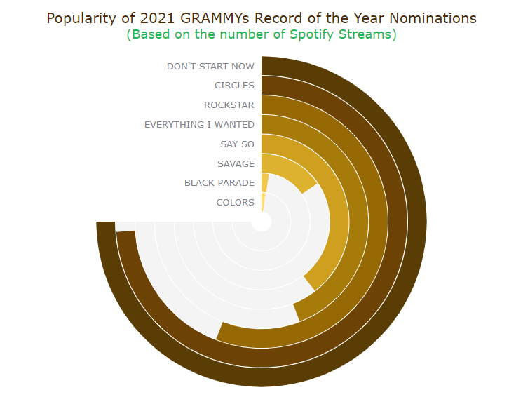
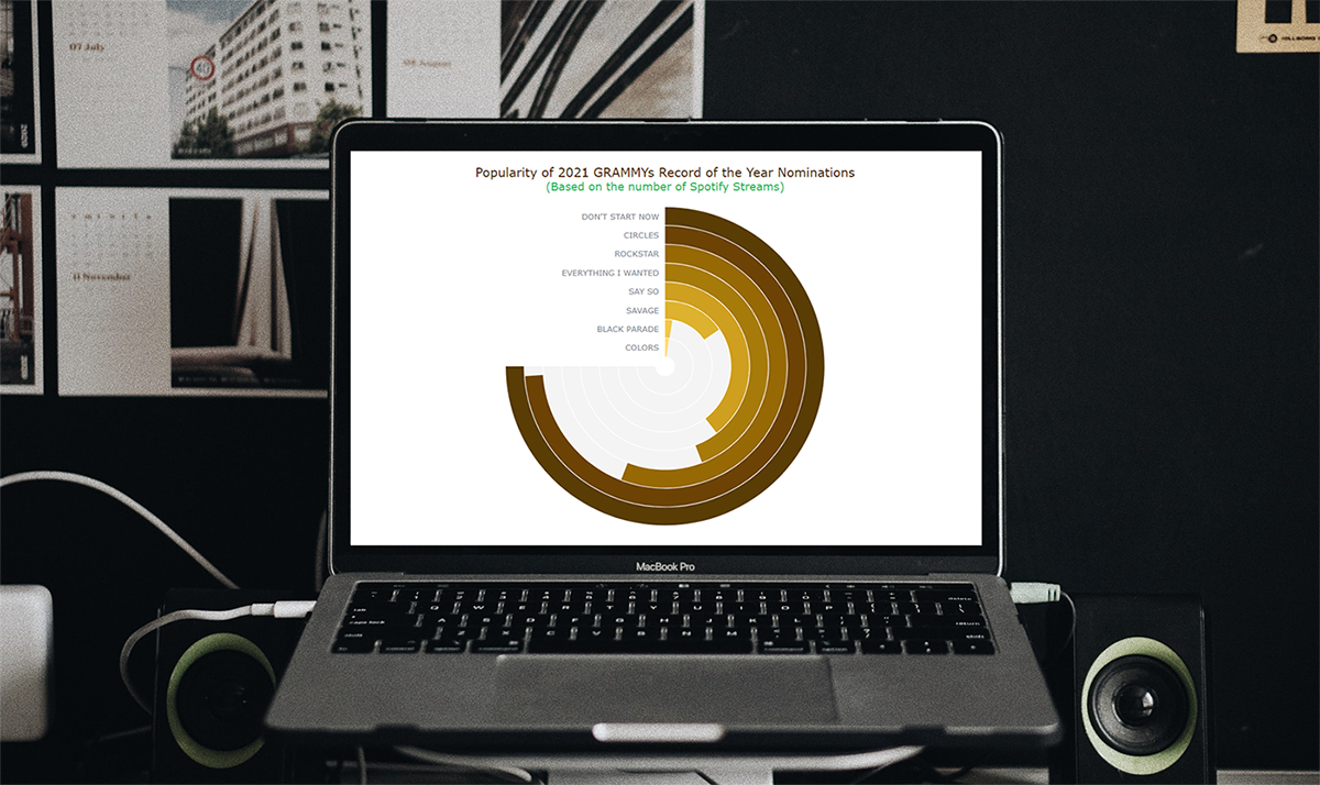
图表控件AnyChart如何创建JavaScript角度规 2021年1月5日 上午7:42 • 软件教程 您想在数据可视化产品组合中添加另一个非常酷和有趣的图表吗?遵循这个简单的教程,您将学习如何使用JavaScript轻松创建漂亮的交互式Angular Gauge! AnyChart是基于JavaScript (HTML5) 的图表控件。使用AnyChart控件,可创建跨浏览器和跨平台的交互式图表和仪表。AnyChart 图表目前已被很多知名大公司所使用,可用于仪表盘、 表、数据分析、统计学、金融等领域。 AnyChart正式版 角规,也称为圆规,是一种带有径向刻度的量规图。这样的可视化可以很好地显示一个范围内的值,并广泛用于各种仪表板中。 疫苗的最新好消息在我们耳边听起来像是音乐。因此,我想为什么不将一些有趣的音乐数据用于本教程中的可视化!第63届年度格莱美奖颁奖典礼将于2021年3月举行,当我浏览年度唱片提名人名单时,我想知道这些歌曲的流行程度。为了找出答案,我决定在世界领先的音乐流媒体平台之一Spotify上查看其流媒体的数量,并认为Solid Angular Gauge在这种视觉分析中可以很好地工作。它也类似于黑胶唱片,这使得它成为表示此类数据时特别有趣的图表类型! 因此,在本教程中,我将在 JS Angular Gauge图表中可视化Spotify流计数的每一首2021 GRAMMYs年度提名歌曲。那将很有趣! 扰流板:待开发的角规 在开始该过程之前,请查看最终的交互式JavaScript角度规图表的外观: 如何通过4个基本步骤构建JS角规 Web开发技能以及HTML和JavaScript等技术始终对交互式数据可视化很有帮助。但是实际上,您甚至不需要太多的技术知识和经验。事实是,为 站或应用程序创建JS角规不是火箭科学。 基本上,有4个基本步骤可使用JavaScript构建角度规: 创建一个HTML页面。 包括必要的JavaScript文件。 连接数据。 编写图表的JS代码。 1.创建一个基本的HTML页面 首先要做的是制作一个HTML页面,在该页面中将呈现角度仪表可视化。我们添加了一个div元素来保存图表,并为其提供一个ID,以在以后正确引用div。 <!DOCTYPE html><html> <head> <title>JavaScript Angular Gauge</title> <style type="text/css"> html, body, #container { width: 100%; height: 100%; margin: 0; padding: 0; } </style> </head> <body> <div id="container"></div> </body></html> 在此,div块元素的宽度和高度为100%,以使量规图表全屏显示。但是,当然可以根据您的要求进行定制。 2.包含必要的JavaScript文件 第二步是在<head>部分中引用要使用的必要脚本。 某些 JavaScript图表库可以非常轻松地创建令人惊叹的图形和图表,以可视化方式显示数据,而没有太多困难。在本教程中,我使用的是AnyChart,它是一个轻量级,灵活且易于使用的JavaScript图表库。它支持开箱即用的角度规,并具有丰富的文档资料。另外,AnyChart JS提供了一个很酷的 代码场来测试事物。 因此,让我们包括该库的CDN中的必要文件 。要创建角规,我们需要添加所有类型的图表所需的 核心模块和角规的 特定模块。 <!DOCTYPE html><html> <head> <title>JavaScript Venn Diagram</title> <script src="https://cdn.anychart.com/releases/8.9.0/js/anychart-core.min.js"></script> <script src="https://cdn.anychart.com/releases/8.9.0/js/anychart-circular-gauge.min.js"></script> <style type="text/css"> html, body, #container { width: 100%; height: 100%; margin: 0; padding: 0; } </style> </head> <body> <div id="container"></div> <script> // All the code for the angular gauge chart will come here </script> </body></html> 3.准备并连接数据 第三步是关于数据。 然后,我根据流的数量对数据进行降序排序,并添加了一个百分比字段。给定最高流记录的100%,然后计算与最高流记录相比的以下记录的百分比。 最后,我创建了一个JSON文件,您可以在此处下载。 可以在数据适配器(通过专用模块提供的其他有用脚本)的帮助下将JSON数据加载到AnyChart中。让我们将其与中的所有JS脚本一起引用 <head>。 接下来,我们使用HTML页面正文中标记loadJsonFile内的方法<script>来加载JSON文件。 <!DOCTYPE html><html> <head> <title>JavaScript Angular Gauge</title> <script src="https://cdn.anychart.com/releases/8.9.0/js/anychart-core.min.js"></script> <script src="https://cdn.anychart.com/releases/8.9.0/js/anychart-circular-gauge.min.js"></script> <script src="https://cdn.anychart.com/releases/8.9.0/js/anychart-data-adapter.min.js"></script> <style type="text/css"> html, body, #container { width: 100%; height: 100%; margin: 0; padding: 0; } </style> </head> <body> <div id="container"></div> <script> anychart.data.loadJsonFile('{JSON data file location here}', function (data) { // The angular gauge's JS code will come here }); </script> </body></html> 现在,我们已经完成了所有初步步骤,让我们兴奋起来,开始添加代码以在基于JS的交互式角度规中可视化数据!4.添加量规的JS代码 要构建任何JS图表或计量器,必须添加一个包含所有代码的函数,这将确保其中的整个代码仅在页面准备好后才能执行。 我们现在创建的立体角规的构建要比其他图表类型(如条形图,饼图或面积 图)稍微复杂一些 。但是,请放心,因为所有代码都已注释,并且我还将通过代码片段指导您。如果仍然感到困惑,只需按照以下步骤进行操作,您就可以立即制作出精美的图表。在帖子评论中提问。 首先,我们提取径向条所需的数据值,创建角度规,然后将提取的数据传递到图表。 <script> anychart.onDocumentReady(function () {anychart.data.loadJsonFile('https://gist.githubusercontent.com/shacheeswadia/9e4598a73bb86180f1726daf9de8062f/raw/b258e93e1f9db37da6847eb05a230afcb64446d5/circularGaugeData.json', function (data) { // Get the names of the records var recordNames = data.map(function(d){ return d.Record; }); // Get the percent values var recordPercentValue = data.map(function(d){ return d.percent; }); // Add the 100% value to signify the max value for each of the radial ring recordPercentValue.push(100); // Set the data to indicate the percent values var dataSet = anychart.data.set(recordPercentValue); // Create the angular gauge var gauge = anychart.gauges.circular(); // Set the data for the angular gauge gauge.data(dataSet); }); });</script> 我希望每个数据点都有不同的颜色。因此,让我们建立一个调色板。最初,我们可以使用AnyChart JavaScript图表库的默认颜色。 接下来,我们指定量规的属性并创建轴。我不想显示轴标签和刻度,所以让我们隐藏它们。 // Set the colors based on the default palettevar palette = anychart.palettes .distinctColors() .items([ '#64b5f6', '#1976d2', '#ef6c00', '#ffd54f', '#455a64', '#dd2c00', '#00838f', '#00bfa5', '#96a6a6', '#ffa000' ]);// Specify the attributes of the angular gauge chartgauge .fill('#fff') .stroke(null) .padding(25, 100, 25, 100) .margin(0) .startAngle(0) .sweepAngle(270);// Create the angular gauge axisvar axis = gauge.axis().radius(100).width(1).fill(null);// Set the minimum and maximum values for the axisaxis .scale() .minimum(0) .maximum(100);// Hide the axis labels and ticksaxis.labels().enabled(false);axis.ticks().enabled(false);axis.minorTicks().enabled(false); 现在是创建角规径向条的主要部分。我们创建一个函数,该函数接受规格,每个径向钢筋的索引以及半径以及径向钢筋的宽度作为参数。然后,我们根据数据点以及每个点的背景径向条构建每个条。 接下来,我们设置标签并将它们对齐以对应于每个径向钢筋。函数中的最后一件事是为每个数据点返回一个量规。 // Create a function to make radial bars for each data pointvar makeBarWithBar = function (gauge, radius, i, width) { // Create the radial bars based on the data gauge .bar(i) .dataIndex(i) .radius(radius) .width(width) .fill(palette.itemAt(i)) .stroke(null) .zIndex(5); // Create the background radial bars indicating the total value gauge .bar(i + 100) .dataIndex(8) .radius(radius) .width(width) .fill('#F5F4F4') .stroke(null) .zIndex(4); // Set the labels based on each data point gauge .label(i) .text(recordNames[i]); // Align the labels gauge .label(i) .hAlign('center') .vAlign('middle') .anchor('right-center') .padding(0, 10) .height(width / 2 + '%') .offsetY(radius + '%') .offsetX(0); return gauge.bar(i);}; 现在已经创建了函数,我们为我们拥有的每个数据点调用函数。总共有8个数据点。因此,我们将函数调用了8次。半径值是100除以数据点的数量,我将每个条的宽度保持为11。 // Call the function to create the radial bars with specificationsmakeBarWithBar(gauge, 100, 0, 11);makeBarWithBar(gauge, 87.5, 1, 11);makeBarWithBar(gauge, 75, 2, 11);makeBarWithBar(gauge, 62.5, 3, 11);makeBarWithBar(gauge, 50, 4, 11);makeBarWithBar(gauge, 37.5, 5, 11);makeBarWithBar(gauge, 25, 6, 11);makeBarWithBar(gauge, 12.5, 7, 11); 然后,我们向图表添加标题。最后,我们参考div容器并绘制角度规。 // Add the angular gauge chart titlegauge.title('Comparing Popularity of 2021 GRAMMYs Record of the Year Nominations on Spotify');// Drawing the resulting angular gaugegauge.container('container');gauge.draw(); 到位了-功能齐全且功能强大且基于JavaScript的Angular Gauge已准备就绪!或者,您可以根据需要将其称为圆规或径向规。 从角度计中我们可以清楚地看到,这些音轨的流行程度有很大的不同。Dua Lipa的“ Do n’t Start Now”是2021年度格莱美唱片年度提名名单中最受欢迎的歌曲,在Spotify上的流媒体数量高达12.6亿,紧随其后的是Post Malone的“ Circles”,流媒体数量为12.4亿。通过此参数,这两个是绝对的领导者。这是否意味着其中之一将获胜/p>Black Pumas的歌曲“ Colors”确实有3600万个流,但最终成为该组中流最少的歌曲。 看看Angular Gauge的初始版本,以及Playground或 CodePen上的完整JS / CSS / HTML代码 。JavaScript角度规定制 用于数据可视化的强大JavaScript库不仅简化了图表创建,而且还提供了进行自定义的灵活性。通过一些代码调整,我们可以对圆形图形进行快速有效的更改。 让我们看一下角度规的一些不同功能和美观性。 更改调色板 由于我们的数据是关于格莱美提名的,因此我决定使用类似于镀金留声机奖杯的颜色,并介绍相应的调色板。我们已经创建了具有不同颜色的调色板,因此让我们用新颜色替换默认颜色。 // Set the colors based on the designated palettevar palette = anychart.palettes .distinctColors() .items([ '#593d04', '#6c4304', '#966905', '#a77b0a', '#cf9f20', '#ddb22e', '#f1c84d', '#ffdc73' ]); 看到图表看起来更具个性化-这是使用JS构建的Angular Gauge,现在进行了以下修改: 在Playground或CodePen上签出。 设置自定义栏大小 现在,让我们对径向条进行一些实验,并将更多信息添加到当前图表中。 例如,我们可以使每个条形的宽度代表歌曲的持续时间。 为此,我们需要从数据中提取每首歌曲的持续时间,然后创建一个循环,使每个小节的宽度与该数据点的持续时间相对应。 // Get the time of each songvar recordLength = data.map(function(d){ return d['Time'];});// Call the function to create the radial bars with specificationsfor(var i=0, j=100; i<data.length, j>=12.5; i++, j-=12.5){ makeBarWithBar(gauge, j, i, (recordLength[i]* 2.75));} 您可以在Playground或CodePen上找到带有完整代码的此版本。 最终,我没有发现它很有见地,而是恢复为每个小节都固定宽度的版本。我确实保留了循环,因为这样可以减少代码量,并且是重复调用函数的更好方法。 改进角度规工具提示的设计和其他格式 我们制作的JavaScript角度规已经看起来很棒。我们可能需要的只是一些最后的修饰。 让我们设计一个美观且有用的工具提示。 首先,请注意此处的更改: // Add the 100% value to signify the max value for each of the radial ringvar initialLength = recordPercentValue.length;recordPercentValue.length *= 2;recordPercentValue.fill(100, initialLength);...// Create the background radial bars indicating the total valuegauge .bar(i + 100) .dataIndex(initialLength + I) .radius(radius) .width(width) .fill('#F5F4F4') .stroke(null) .zIndex(4); 我们添加以下部分: // Angular gauge tooltipgauge.tooltip().useHtml(true);// Format the information of the tooltipgauge .tooltip() .format(function(){ var index = this.index; if (index >= initialLength) index -= initialLength; return "<div style='font-size:15px; font-weight:400; margin: 0.2rem 0; color: #1db954; padding:0.15rem'>Record: <span style='color:#fff;'>" + data[index]['Record'] + "</span></div><div style='font-size:15px; font-weight:400; margin: 0.2rem 0; color: #1db954; padding:0.15rem'>Artist: <span style='color:#fff;'>" + data[index]['Artist'] + "</span></div><div style='font-size:15px; font-weight:400; margin: 0.2rem 0; color: #1db954; padding:0.15rem'>Number of Spotify Streams: <span style='color:#fff;'>" + Intl.NumberFormat().format(data[index]['StreamsSpotify']) + "</span></div><div style='font-size:15px; font-weight:400; margin: 0.2rem 0; color: #1db954; padding:0.15rem'>Comparitive Popularity: <span style='color:#fff;'>" + data[index]['percent'] + "%</span></div>"; }); 最后,使用较大的字体美化标题并应用一些颜色更改以突出显示我们所显示的内容应该很棒: // Add the angular gauge chart titlegauge .title() .useHtml(true) .text( '<span style = "color: #4c2b04; font-size:20px;">Comparing Popularity of 2021 GRAMMYs Record of the Year Nominations</span>' + '<br/><span style="color:#1db954; font-size: 18px;">(Based on the number of Spotify Streams)</span>' ); 您可以在下面找到此最终角规的完整源代码,并在Playground或CodePen上进行研究和使用。 <!DOCTYPE html><html> <head> <title>JavaScript Angular Gauge</title> <script src="https://cdn.anychart.com/releases/8.9.0/js/anychart-core.min.js"></script> <script src="https://cdn.anychart.com/releases/8.9.0/js/anychart-circular-gauge.min.js"></script> <script src="https://cdn.anychart.com/releases/8.9.0/js/anychart-data-adapter.min.js"></script> <style type="text/css"> html, body, #container { width: 100%; height: 100%; margin: 0; padding: 0; } </style> </head> <body> <div id="container"></div> <script>anychart.onDocumentReady(function () {anychart.data.loadJsonFile('https://gist.githubusercontent.com/shacheeswadia/9e4598a73bb86180f1726daf9de8062f/raw/b258e93e1f9db37da6847eb05a230afcb64446d5/circularGaugeData.json', function (data) { // Get the names of the records var recordNames = data.map(function(d){ return d.Record; }); // Get the percent values var recordPercentValue = data.map(function(d){ return d.percent; }); // Add the 100% value to signify the max value for each of the radial ring var initialLength = recordPercentValue.length; recordPercentValue.length *= 2; recordPercentValue.fill(100, initialLength); // Set the data to indicate the percent values var dataSet = anychart.data.set(recordPercentValue); // Create the angular gauge var gauge = anychart.gauges.circular(); // Set the data for the angular gauge gauge.data(dataSet); // Set the colors based on the designated palette var palette = anychart.palettes .distinctColors() .items([ '#593d04', '#6c4304', '#966905', '#a77b0a', '#cf9f20', '#ddb22e', '#f1c84d', '#ffdc73' ]); // Specify the attributes of the angular gauge chart gauge .fill('#fff') .stroke(null) .padding(25, 100, 25, 100) .margin(0) .startAngle(0) .sweepAngle(270); // Create the angular gauge axis var axis = gauge.axis().radius(100).width(1).fill(null); // Set the minimum and maximum values for the axis axis .scale() .minimum(0) .maximum(100); // Hide the axis labels and ticks axis.labels().enabled(false); axis.ticks().enabled(false); axis.minorTicks().enabled(false); // Create a function to make radial bars for each data point var makeBarWithBar = function (gauge, radius, i, width) { // Create the radial bars based on the data gauge .bar(i) .dataIndex(i) .radius(radius) .width(width) .fill(palette.itemAt(i)) .stroke(null) .zIndex(5); // Create the background radial bars indicating the total value gauge .bar(i + 100) .dataIndex(initialLength + i) .radius(radius) .width(width) .fill('#F5F4F4') .stroke(null) .zIndex(4); // Set the labels based on each data point gauge .label(i) .text(recordNames[i]); // Align the labels gauge .label(i) .hAlign('center') .vAlign('middle') .anchor('right-center') .padding(0, 10) .height(width / 2 + '%') .offsetY(radius + '%') .offsetX(0); return gauge.bar(i); }; // Angular gauge tooltip gauge.tooltip().useHtml(true); // Format the information of the tooltip gauge .tooltip() .format(function(){ var index = this.index; if (index >= initialLength) index -= initialLength; return "<div style='font-size:15px; font-weight:400; margin: 0.2rem 0; color: #1db954; padding:0.15rem'>Record: <span style='color:#fff;'>" + data[index]['Record'] + "</span></div><div style='font-size:15px; font-weight:400; margin: 0.2rem 0; color: #1db954; padding:0.15rem'>Artist: <span style='color:#fff;'>" + data[index]['Artist'] + "</span></div><div style='font-size:15px; font-weight:400; margin: 0.2rem 0; color: #1db954; padding:0.15rem'>Number of Spotify Streams: <span style='color:#fff;'>" + Intl.NumberFormat().format(data[index]['StreamsSpotify']) + "</span></div><div style='font-size:15px; font-weight:400; margin: 0.2rem 0; color: #1db954; padding:0.15rem'>Comparitive Popularity: <span style='color:#fff;'>" + data[index]['percent'] + "%</span></div>"; }); // Call the function to create the radial bars with specifications for(var i=0, j=100; i<data.length, j>=12.5; i++, j-=12.5){ makeBarWithBar(gauge, j, i, 12); } // Add the angular gauge chart title gauge .title() .useHtml(true) .text( '<span style = "color: #4c2b04; font-size:20px;">Comparing Popularity of 2021 GRAMMYs Record of the Year Nominations</span>' + '<br/><span style="color:#1db954; font-size: 18px;">(Based on the number of Spotify Streams)</span>' ); gauge .title() .enabled(true) .hAlign('center') .padding(0) .margin([0, 0, 10, 0]); // Drawing the resulting angular gauge gauge.container('container'); gauge.draw(); });}); </script> </body></html> 结论 在本分步教程中,我向您详细介绍了如何使用JavaScript(HTML5)创建引人注目的Angular Gauge。如您所见,创建交互式JS图表很容易。 您可以尝试其他JavaScript图表库,并评估它们在创建所需数据可视化中的功能。或者,您可以查看AnyChart提供的其他各种图表选项。为了获得启发,您可能希望访问图书馆的库以获取基本图表类型。 请随时问我任何问题,或让我知道您的JS量规的结果。 相关产品推荐:AnyGantt-构建复杂且内容丰富的甘特图的理想工具 AnyMap-可交互式地图是AnyChart组件 AnyStock-基于XML/JSON的Flash金融图表解决方案 APS帮助提升企业生产效率,真正实现生产计划可视化呈现与控制,快速有效响应不同场景的生产计划,提高准时交货能力,提高产能和资源利用率 想要购买AnyChart正版授权,或了解更多产品信息请点击【咨询在线客服】 标签: 声明:本站部分文章及图片源自用户投稿,如本站任何资料有侵权请您尽早请联系jinwei@zod.com.cn进行处理,非常感谢! 0 生成海 Word开发工具Aspose.Words功能演示:使用C ++保护或取消保护Word文档 上一篇 2021年1月5日 如何用Qt实现Office界面样式–QtitanRibbon 下一篇 2021年1月5日 相关推荐 代码保护软件VMProtect用户手册之内置脚本的使用(1) 2019年6月12日 做好精益生产,实现卓越制造 2022年1月17日 SOLIDWORKS 8个实用冷门的小技巧,有哪些你还没用到? 2021年6月25日 Word处理控件Aspose.Words功能演示:使用 Java 拆分 MS Word 文档 2022年10月18日 Zend Studio使用教程:使用PHPUnit检测代码(一) 2019年1月7日 质性数据分析软件NVivo教程:如何自动编码文件 2019年11月13日 发表回复 请登录后评论... 登录后才能评论 提交