有很多种方法可以在QML中定位项目,以下是简要的概述。
手动定位
通过设置项目的 x,y 属性,可以将项目放置在屏幕上的特定 x,y 坐标处。 根据可视化坐标系规则,这将设置它们相对于父级左上角的位置。
结合使用绑定替代这些属性的常量值,通过将 x 和 y 坐标设置为适当的绑定,也可以轻松实现相对定位。
import QtQuickItem {width: 100; height: 100Rectangle {// Manually positioned at 20,20x: 20y: 20width: 80height: 80color: "red"}}


锚定
Item类型提供了锚定到其他Item类型的功能,每个项目有7条锚线:左、右、垂直居中、顶部、底部、基线和水平居中。三个垂直锚线可以锚定到另一个项目的三个垂直锚线中的任何一个,四个水平锚线可以锚定到另一个项目的水平锚线。
import QtQuickItem {width: 200; height: 200Rectangle {// Anchored to 20px off the top right corner of the parentanchors.right: parent.rightanchors.top: parent.topanchors.margins: 20 // Sets all margins at oncewidth: 80height: 80color: "orange"}Rectangle {// Anchored to 20px off the top center corner of the parent.// Notice the different group property syntax for 'anchors' compared to// the previous Rectangle. Both are valid.anchors { horizontalCenter: parent.horizontalCenter; top: parent.top; topMargin: 20 }width: 80height: 80color: "green"}}

定位器
对于想要以常规模式定位一组类型的常见情况,Qt Quick提供了一些定位器类型。放置在定位器中的物品会以某种方式自动定位; 例如, Row将项目定位为水平相邻(形成一行)。
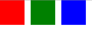
import QtQuickItem {width: 300; height: 100Row { // The "Row" type lays out its child items in a horizontal linespacing: 20 // Places 20px of space between itemsRectangle { width: 80; height: 80; color: "red" }Rectangle { width: 80; height: 80; color: "green" }Rectangle { width: 80; height: 80; color: "blue" }}}
布局类型
Layout types功能与定位器类似,但允许进一步细化或限制布局。 具体来说,Layout types允许您:
- 设置文本和其他项目的对齐方式
- 自动调整和填充分配的应用程序区域
- 设置尺寸限制,例如最小或最大尺寸
- 设置布局内项目之间的间距
GroupBox {id: gridBoxtitle: "Grid layout"Layout.fillWidth: trueGridLayout {id: gridLayoutrows: 3flow: GridLayout.TopToBottomanchors.fill: parentLabel { text: "Line 1" }Label { text: "Line 2" }Label { text: "Line 3" }TextField { }TextField { }TextField { }TextArea {text: "This widget spans over three rows in the GridLayout.n"+ "All items in the GridLayout are implicitly positioned from top to bottom."Layout.rowSpan: 3Layout.fillHeight: trueLayout.fillWidth: true}}}
上面的代码片段来自基本布局示例,该代码段显示了在布局中添加各种字段和项目的简单性。 GridLayout 可以调整大小,并且可以通过各种属性自定义其格式。
Qt商用组件推荐
- QtitanRibbon – Ribbon UI组件:是一款遵循Microsoft Ribbon UI Paradigm for Qt技术的Ribbon UI组件,QtitanRibbon致力于为Windows、Linux和Mac OS X提供功能完整的Ribbon组件。
- QtitanChart – Qt类图表组件:是一个C ++库,代表一组控件,这些控件使您可以快速地为应用程序提供漂亮而丰富的图表。
- QtitanNavigation:QtitanNavigationDesignUI 组件是一组 GUI 控件,它实现了菜单、导航框、命令栏等导航界面,并让您以更少的滚动和点击次数有效地查看所有实体(工作区、 格或其他项目)。
- QtitanDocking:允许您像 Visual Studio 一样为您的伟大应用程序配备可停靠面板和可停靠工具栏。黑色、白色、蓝色调色板完全支持 Visual Studio 2019 主题!
Qt技术交流群:166830288 欢迎一起进群讨论
更多Qt产品教程、下载、正版授权资讯,请点击获取

标签:
声明:本站部分文章及图片源自用户投稿,如本站任何资料有侵权请您尽早请联系jinwei@zod.com.cn进行处理,非常感谢!