圆度
Button的圆度通过其rounded属性控制,可以传递给属性的值如下:
- small — 将border radius设置为1px。
- medium(默认) — 将border radius设置为2px。
- large — 将border radius设置为4px。
- full — 将border radius设置为9999px。
- null — 将 null 传递给 rounded 属性使我们可以选择定义自定义 CSS 类,该类定义按钮的border-radius。
以下示例演示了每个舍入选项的用法:


main.vue
<template><div><span class="wrapper"><kbutton>No roundness</kbutton></span><span class="wrapper"><kbutton :rounded="'small'">Small roundness</kbutton></span><span class="wrapper"><kbutton :rounded="'medium'">Medium roundness</kbutton></span><br /><br /><span class="wrapper"><kbutton :rounded="'large'">Large roundness</kbutton></span><span class="wrapper"><kbutton :rounded="'full'">Full roundness</kbutton></span><span class="wrapper"><kbutton :size="null" :class="'custom-roundness'">Custom roundness</kbutton></span></div></template><script>import { Button } from '@progress/kendo-vue-buttons';export default {components: {kbutton: Button,}};</script><style>.custom-roundness.k-button {border-top-right-radius: 15px;border-top-left-radius: 15px;}.wrapper {padding: 20px;}</style>
main.js
import { createApp } from 'vue'import App from './main.vue'createApp(App).mount('#app')
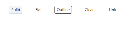
填充模式
Button的样式是通过其 fillMode 属性控制的,可以传递给属性的值如下:
- solid(默认) — 设置一个background颜色和solid borders。
- flat — 在默认状态下设置transparent background和borders,在焦点状态下设置background color。
- outline — 设置transparent background 和 solid borders。
- clear — 在默认状态下设置transparent background和borders,在焦点状态下设置background color。
- link — 设置transparent background 和 solid borders。
- null — 将 null 传递给 fillMode 属性使我们可以选择定义自定义 CSS 类,该类定义按钮的background和border。
以下示例演示了每个 fillMode 选项的用法:
main.vue
<template><div><span class="wrapper"><kbutton :fill-mode="'solid'">Solid</kbutton></span><span class="wrapper"><kbutton :fill-mode="'flat'">Flat</kbutton></span><span class="wrapper"><kbutton :fill-mode="'outline'">Outline</kbutton></span><span class="wrapper"><kbutton :fill-mode="'clear'">Clear</kbutton></span><span class="wrapper"><kbutton :fill-mode="'link'">Link</kbutton></span></div></template><script>import { Button } from '@progress/kendo-vue-buttons';export default {components: {kbutton: Button,},};</script><style>.wrapper {padding: 20px;}</style>
main.js
import { createApp } from 'vue'import App from './main.vue'createApp(App).mount('#app')
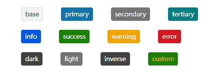
主题颜色
Button 的颜色是通过其 themeColor 属性控制的。
- base(默认) — Button 的颜色将基于base主题颜色。
- primary — Button 的颜色将基于primary主题颜色。
- secondary — Button 的颜色将基于thesecondary主题颜色。
- tertiary — Button 的颜色将基于tertiary主题颜色。
- info — Button 的颜色将基于info 主题颜色。
- success — Button 的颜色将基于success主题颜色。
- warning — Button 的颜色将基于warning主题颜色。
- error — Button 的颜色将基于error主题颜色。
- dark — Button 的颜色将基于dark主题颜色。
- light — Button 的颜色将基于light主题颜色。
- inverse — Button 的颜色将基于inverse主题颜色。
- null — 将 null 传递给 themeColor 属性使我们可以选择定义一个自定义 CSS 类来设置按钮的外观。
以下示例演示了每个 themeColor 选项的用法:
main.vue
<template><div><span class="wrapper"><kbutton :theme-color="'base'">base</kbutton></span><span class="wrapper"><kbutton :theme-color="'primary'">primary</kbutton></span><span class="wrapper"><kbutton :theme-color="'secondary'">secondary</kbutton></span><span class="wrapper"><kbutton :theme-color="'tertiary'">tertiary</kbutton></span><br /><br /><span class="wrapper"><kbutton :theme-color="'info'">info</kbutton></span><span class="wrapper"><kbutton :theme-color="'success'">success</kbutton></span><span class="wrapper"><kbutton :theme-color="'warning'">warning</kbutton></span><span class="wrapper"><kbutton :theme-color="'error'">error</kbutton></span><br /><br /><span class="wrapper"><kbutton :theme-color="'dark'">dark</kbutton></span><span class="wrapper"><kbutton :theme-color="'light'">light</kbutton></span><span class="wrapper"><kbutton :theme-color="'inverse'">inverse</kbutton></span><span class="wrapper"><kbutton :theme-color="null" :class="'custom-color'">custom</kbutton></span></div></template><script>import { Button } from '@progress/kendo-vue-buttons';export default {components: {kbutton: Button,}};</script><style>.wrapper {padding: 20px;}.custom-color {background-color: green;color: orange;}</style>
main.js
import { createApp } from 'vue'import App from './main.vue'createApp(App).mount('#app')
Telerik_KendoUI产品技术交流群:726377843 欢迎一起进群讨论

标签:
声明:本站部分文章及图片源自用户投稿,如本站任何资料有侵权请您尽早请联系jinwei@zod.com.cn进行处理,非常感谢!